Above the Fold and How to Use it Effectively
What is Above the Fold, why it is important, and what can you do to improve your website now that you know about it?

What is the Fold?
It is as it sounds. The Fold on a website is just like a newspaper.
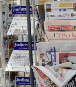 When the broadsheets sit on the newsstand and display their articles, everything “above the fold” was what you see at the Newsagents as you walk past.
This means Editors always strive to ensure that their catchy headlines and leading articles are the ones that grabbed the attention of the reader and caused them to buy the newspaper and read beyond the fold.
On websites, there is a Fold too. Most notably, it is seen when you access a website from a computer and a tablet. Mobile devices have a fold, but it is a little more undefined than larger screens.
Does Screen Size Matter?
Let’s answer this by talking about your Television. When you look at a small 20″ screen and you are watching Bruce Willis blow up another building, how do you feel about it?
Do you need to sit closer? What about sitting further back, how is the impact of the screen affecting you?
Now let’s re-run that with a huge 55″ TV screen. Same movie, same seating positions, how does the effect make you feel?
Of course, we can go even larger to a cinema screen but you get my drift. The larger the screen the more you become immersed in the content. Equally the larger the screen the more you have to look around at what’s happening.
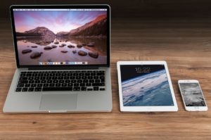 We can access the web through a multitude of devices too and the effect each website has on us also affects how we feel towards it.
Take the Google Home page as an example here. Whether you are on a huge computer screen or looking at your phone screen the same image appears. You know what’s going on and have a similar experience.
If you tried to do the same with Yahoo on a large screen, it is crowded with news stories and adverts, and on a mobile, the same major story runs above the fold, but with a cleaner, less crowded feel. Two different experiences for their audience.
These two differences matter to how you access web stories and the way you are tempted to keep reading past the fold.
(This article is not going to cover resolution or screen magnifiers though these also impact on the experience of accessing the web.)
What is seen on the screen through those variable sizes matters a lot. Equally, what resolution a person uses to see something is also important.
The Fold is Arbitrary, isn’t it?
The question then is, “What is the best screen size that always shows a constant fold for my website?”
Answer: “There aren’t any!”
The way a user enters a website is pretty much out of your control, but what you do with your website layout and the settings you employ certainly can affect it.

Above the fold generally means the point at which the top part of a webpage can be seen. Just as you are viewing this post. You had to scroll down to continue to read, but the initial headline and images would be very close to the top.
Just like a broadsheet newspaper, the page is folded in half and only half of the story can be seen. It is the same for a website. You continue to read past the initial headline.
This is where you need to consider if your header image is taking up the whole screen creating a poor experience for your own audience. Is the menu in the way, how does that slogan look now when it dominates every page over your hard written posts?
If you are looking for a more rounded approach you will need to find out more about ‘Responsive’ websites. (I am currently updating my notes for that term) This, in short, is a Website theme that can adjust for large screens, tablets and phones to offer the user the best view of your website. More on that in a later post.
What Should You Put Above the Fold?
“Why is it important?” I can hear you ask.
You made the great effort of attracting a potential reader to your page. They click on your link and your page appeared for them to read and they got…
A giant heading and half a picture OR worse, they were greeted by a banner ad at the top, using those precious few seconds to attract the user into the website and it was showing an ad that had no reference for them.
The title looked good when they clicked and the result was a messy looking website with text at the sides, the menu on the left, small writing in the middle and more sidebars on the right. Again, another visitor clicks away, or worse, they click the back button.
The Point of Entry
If you have been online for a while now, you will have a feel of what a landing page looks like. A catchy title at the top, maybe a video starts playing, a button to explore more further below, and there you have it, you are drawn into the topic and information.
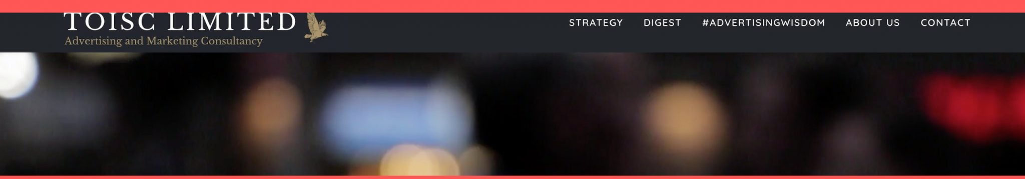
Using Toisc Limited as an example, let’s see how it appears to the visitor and the reasons for its design.
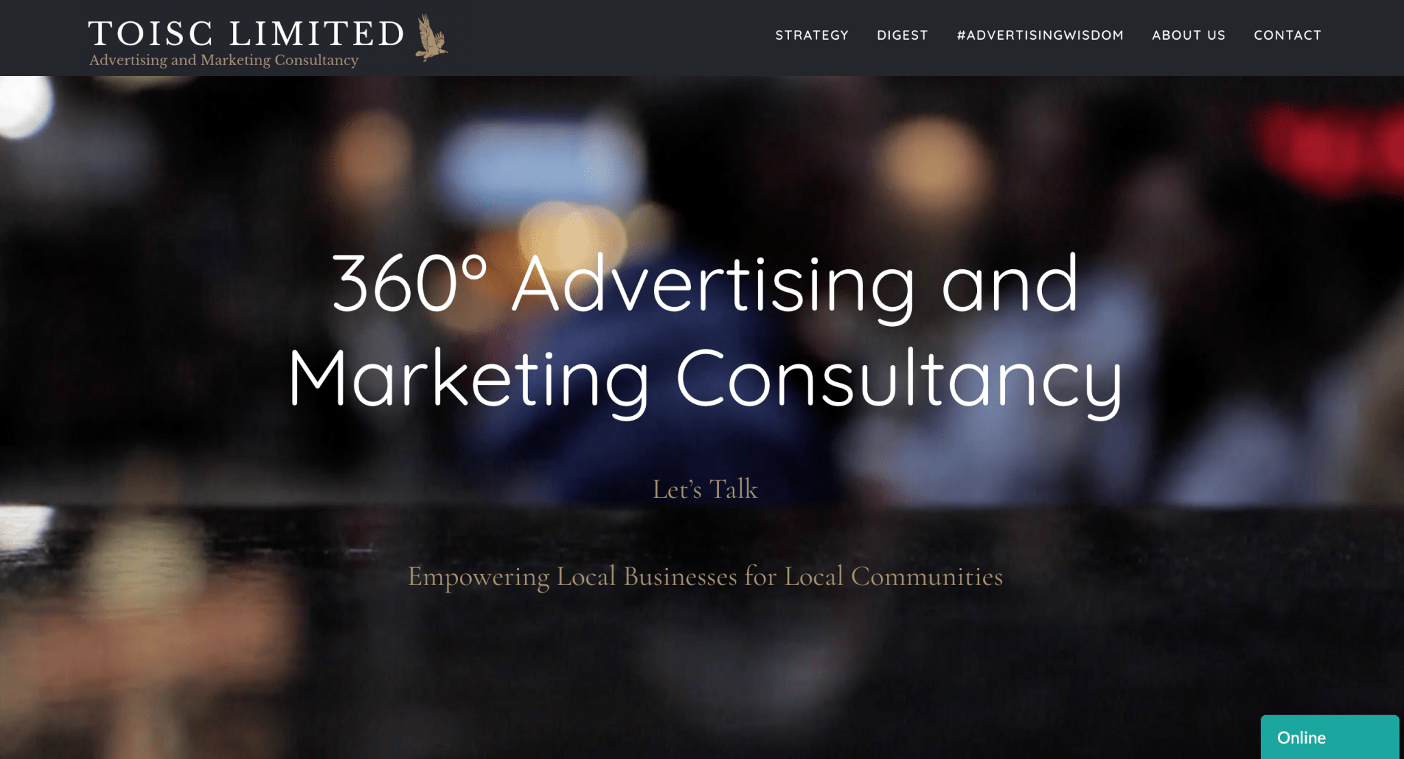
On a large screen, the title and menu reach across the right side of the screen and the main image is a small video with people walking past. There is little text and what text there is tells you immediately what this website is about.
All that is achieved above the fold.
 On the mobile screen version there is a picture (Not a video as it doesn’t always play on a mobile browser and would be worse if there was just a blank screen), but the same feel with the large text and focus areas are present so you know what to do.
Again we used a responsive website to achieve this and it should change how the website is seen depending on what device you are using.
Our chief aim is clarity though. No crowded spaces, only a clear message and easy to access menus.
The fold is important. It confirms to the user they are in the right spot or at the very least they will find out where the right spot is soon enough. The top of your website page should be distraction free, clear enough for your gran to navigate without using her glasses!
How can you improve?
Clear the clutter!
There, easy wasn’t it! Don’t give precious space to advertisements on your website in the top banner. It’s annoying and you will be the loser in the end – unless you are aiming for folks to click those adverts, then carry on.
Splitting my own home screen into thirds will help understand the rule of thirds concept a little easier. I’m thinking in photographic terms here.
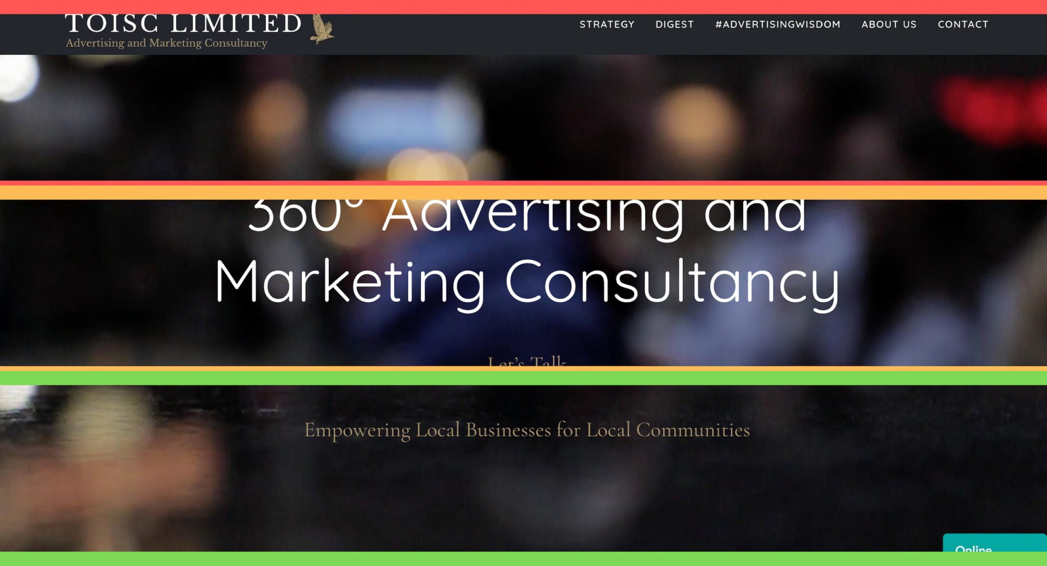
Use as much of the top third above the fold for headings, menus and even a scrolling ticker if you think it will help and in keeping with your website feel.
The middle third should be clear – have lots of space around whatever you want to tell people to do. Use it to draw the user to action. Here we have a Let’s Talk button. A call-to-action.

The bottom third should be the enticement. The text or top of an image that will have me wanting to scroll to see what it is. Explaining what it is that your business focusses on.

The reason for these divisions is to suit different viewing sizes, mobiles and tablets. Imagine my monitor is only 16in. Then I will most likely miss the lower third of the screen you are seeing.
If I also keep the top two thirds for the priority view, then those are the areas most likely to be seen when a visitor arrives.
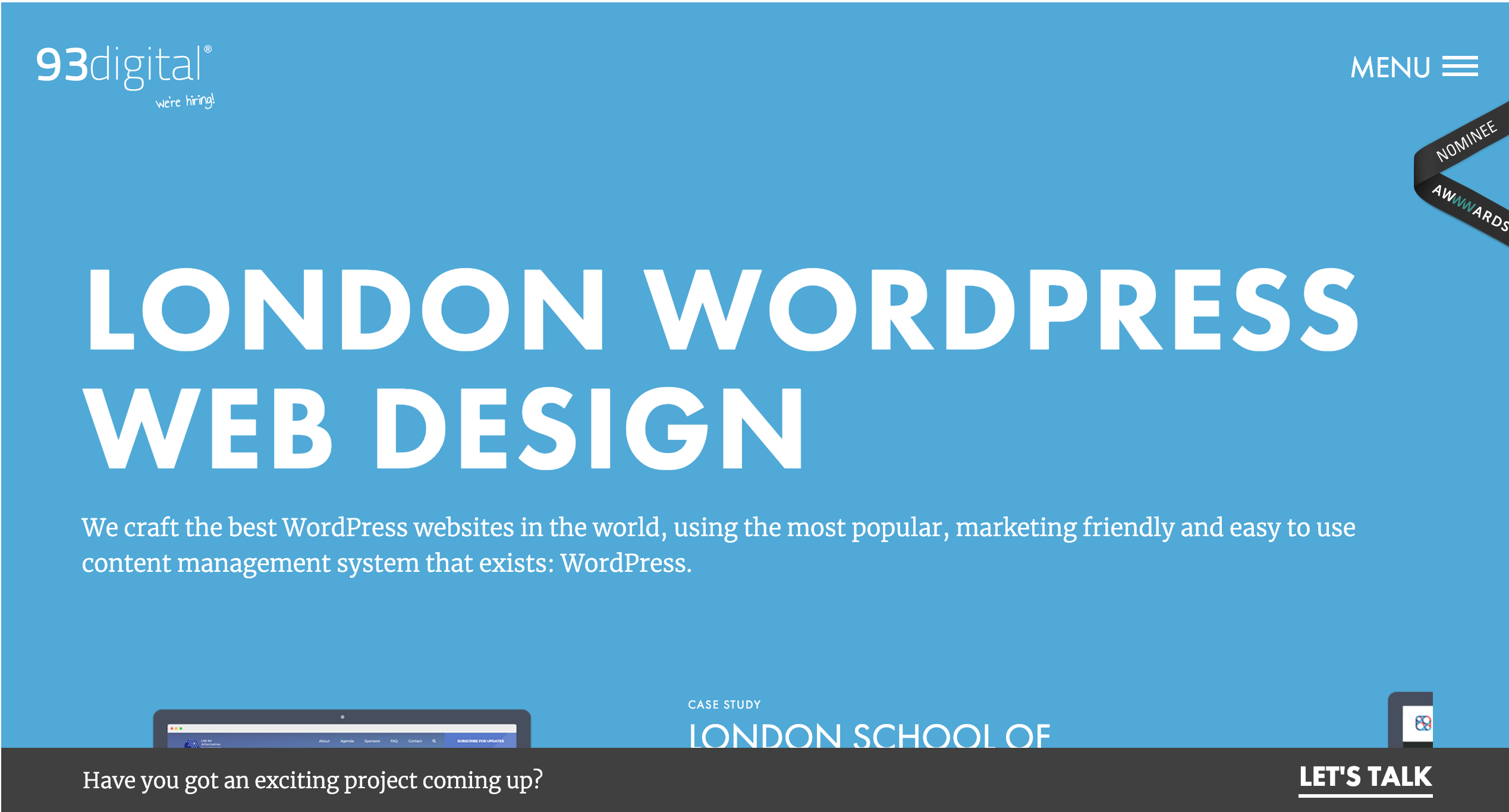
Look at how 93digital (as at 05.02.2019) have their front page laid out. Clear headers, great heading in the centre that tells you exactly what you need to know and the graphic at the bottom. Notice the space around the text to help focus your attention.
Here is techradar (as at 05.02.2019) notice how crowded it looks with all the adverts distracting you away from the website purpose. The reason techradar does so well though is because the titles are what is known as clickbait, or they entice the reader to click the link because they want to know what the story is about.
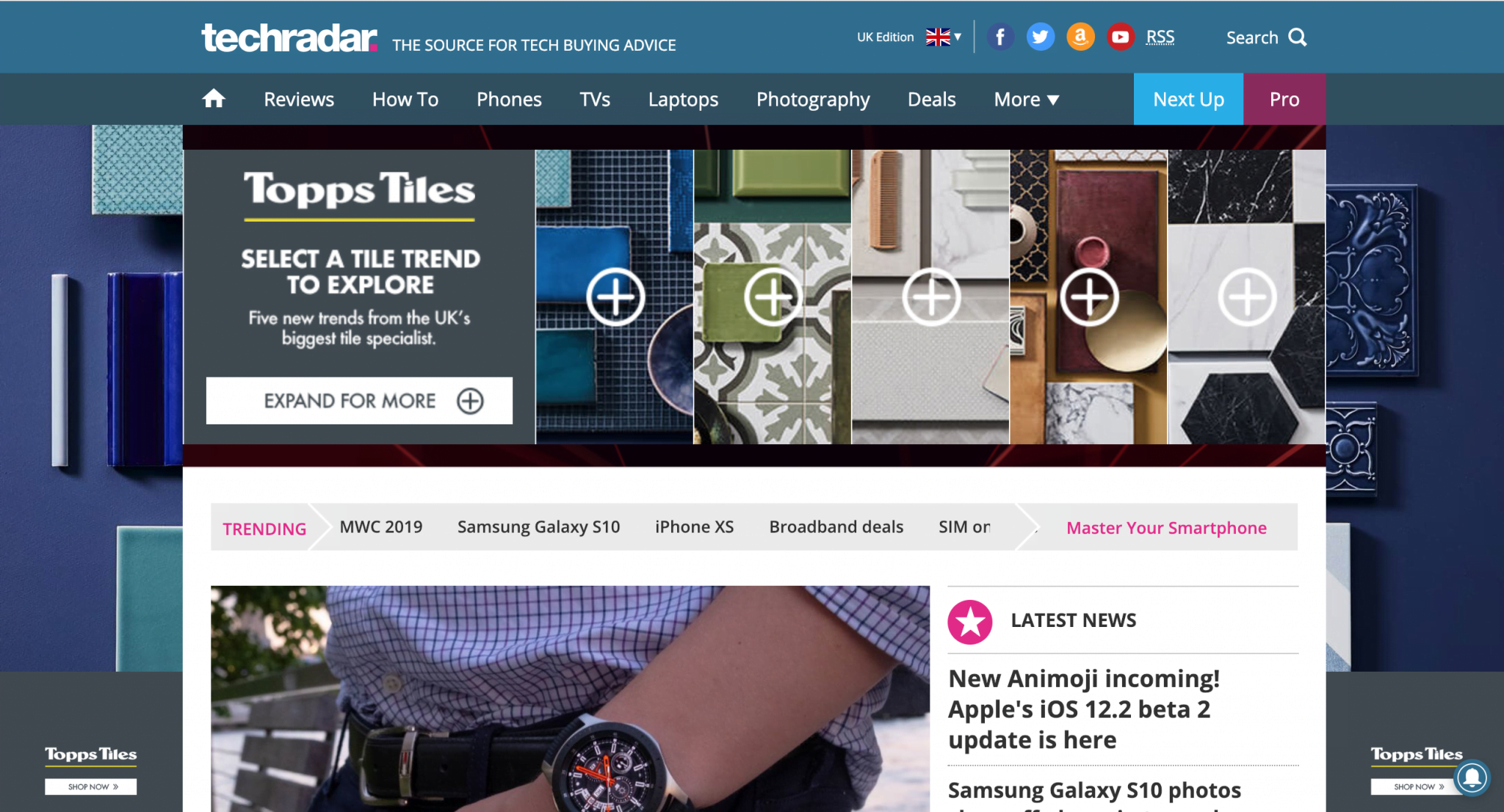
This coupled with plenty of article being uploaded daily results in techradar being one of the big sites on the internet.
Conclusion
Although we are moving more to the mobile screen and getting used to swiping, above the fold is just as important as before. What attracts us to stay on a website, continue looking at its key posts and interact is all credit to thoughtful website design.